IT Code Fair is CDU Sydney’s main annual IT event, run by the Sydney IT Students Association with the Faculty of Science and Technology. For 2026 I was helping coordinate it, which is how I ended up designing it too. The committee needed an invitation for the soft launch, posters for campus, name tags for a few hundred people and certificates for winners, and it all had to look like one thing.
The constraint I set myself was restraint. The university has its own strong marks, and SISA has a logo. Anything loud would fight with both. So the system is quiet: a warm cream ground, deep navy type, and a single crimson accent used for things that matter. Square brackets became the recurring mark, partly as a nod to code and partly because they frame whatever sits inside them without competing.
Typography does the talking. A serif for anything a human reads aloud, like the event name and date. A monospaced face in letter-spaced caps for metadata: times, venues, roles, handles. That split means the hierarchy survives even when the layout changes shape.
The poster went through eight versions: a code-editor invitation, a terminal prompt, wall-sized SOFT LAUNCH type in navy and crimson. Each round, the committee and I took something away. In the end we came back to the quietest direction, the first one, and refined it until the invitation read top to bottom in one breath: who, what, when, where, how to enter.
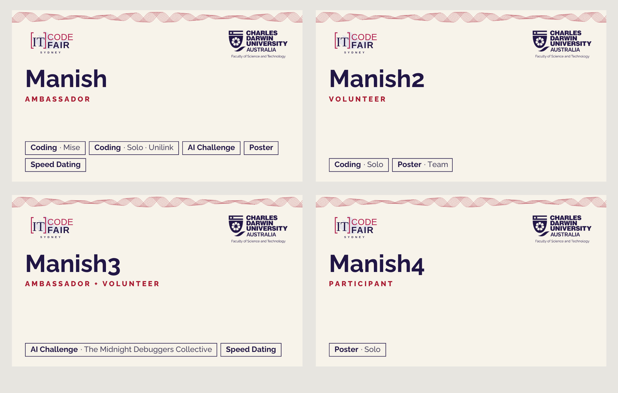
Name tags were the fun part. Volunteers needed to read a lanyard across a room, so I tried six systems: colour bands by role, a tick for every competition, a signal strip, passport stamps and a monogram on CDU purple. The one that shipped is the simplest: the role in colour under the name, and each competition a person is entered in as a small chip. It still works when someone is in five competitions at once.
Certificates reuse the same grid and marks so a winner’s certificate looks like it came from the same event they walked into. That is really the whole job of an identity: make the first thing you see and the last thing you take home feel like one decision.